


VANCOUVER 2010 OLYMPIC & PARALYMPIC WINTER GAMES
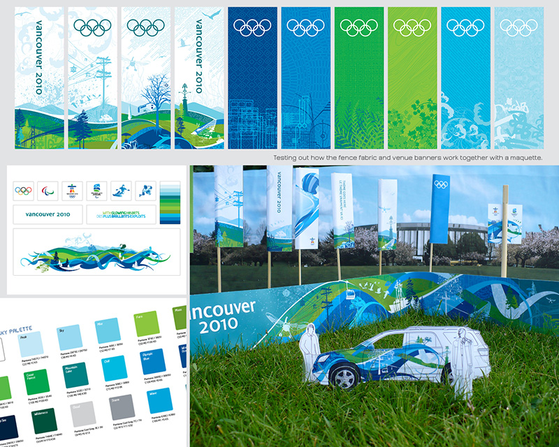
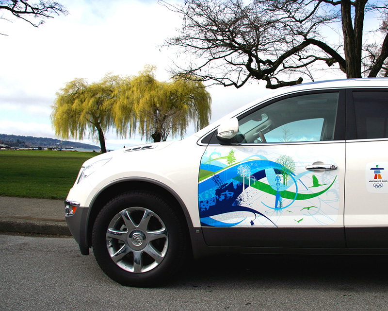
BRIEF #1 as Designer, Brand + Creative Services: Collaboratively develop a visual identity system that can be applied across thousands of applications including fence fabric, supergraphics, vehicle wraps, banners, merchandise, and of course, the hockey puck. Make it reflect our host region, our nation, and the Olympic ideals. Shatter stereotypes. Share our cultural uniqueness with the world in a youthful and surprising way. Make it fresh, progressive, and diverse, like our country, so that athletes are proud to compete in front of it, sponsors are inspired to support it, and fans want to wear it. The brief was a tall order but we tackled it like the once-in-a-lifetime opportunity that it was.
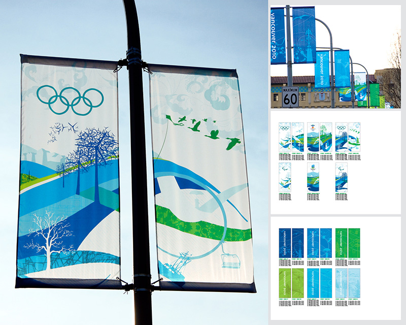
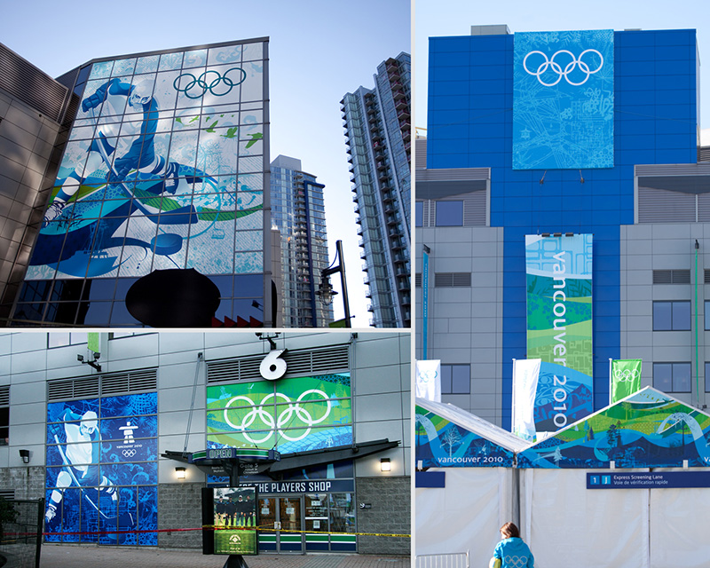
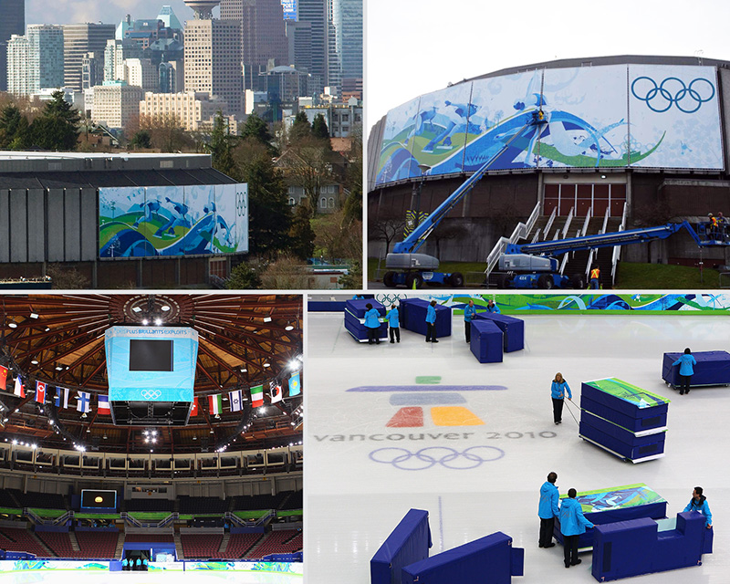
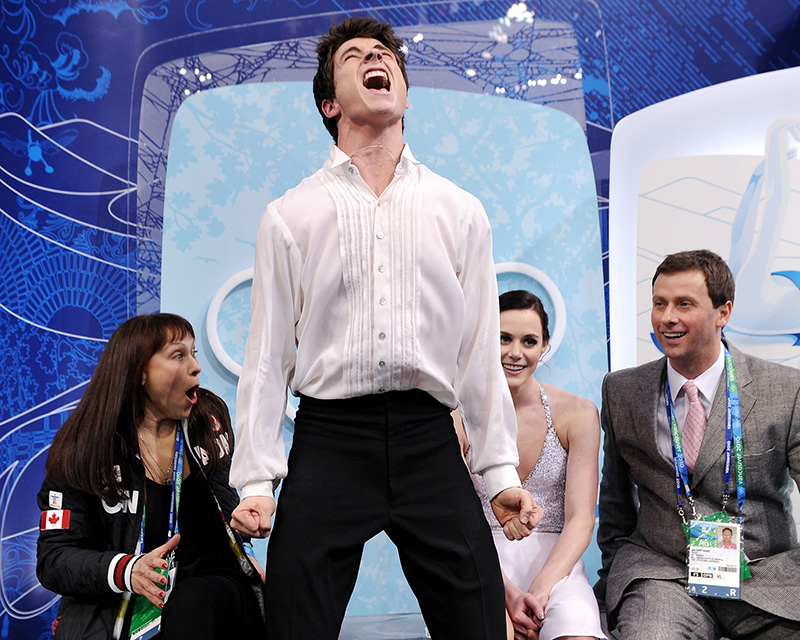
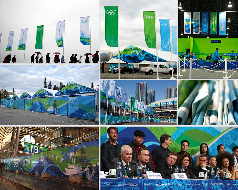
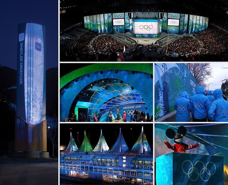
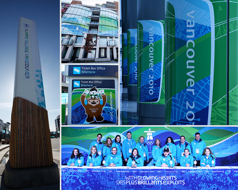
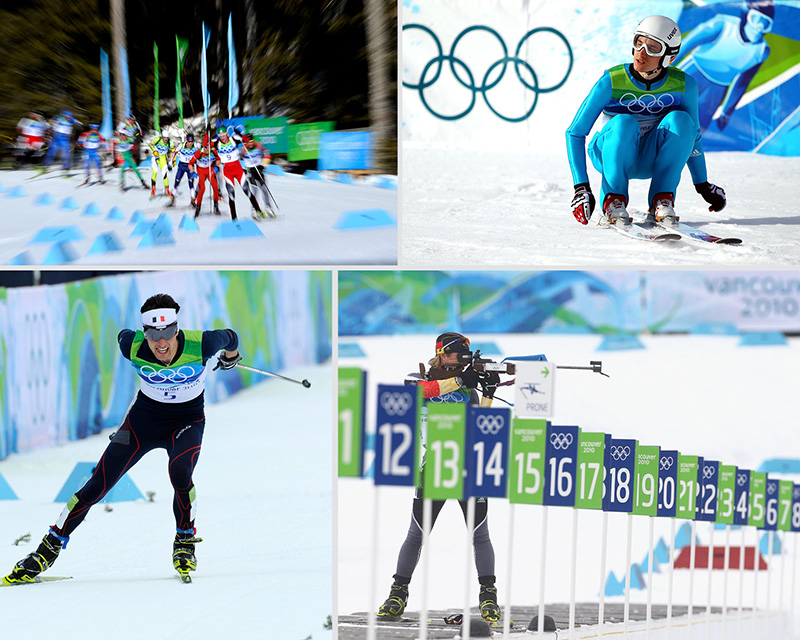
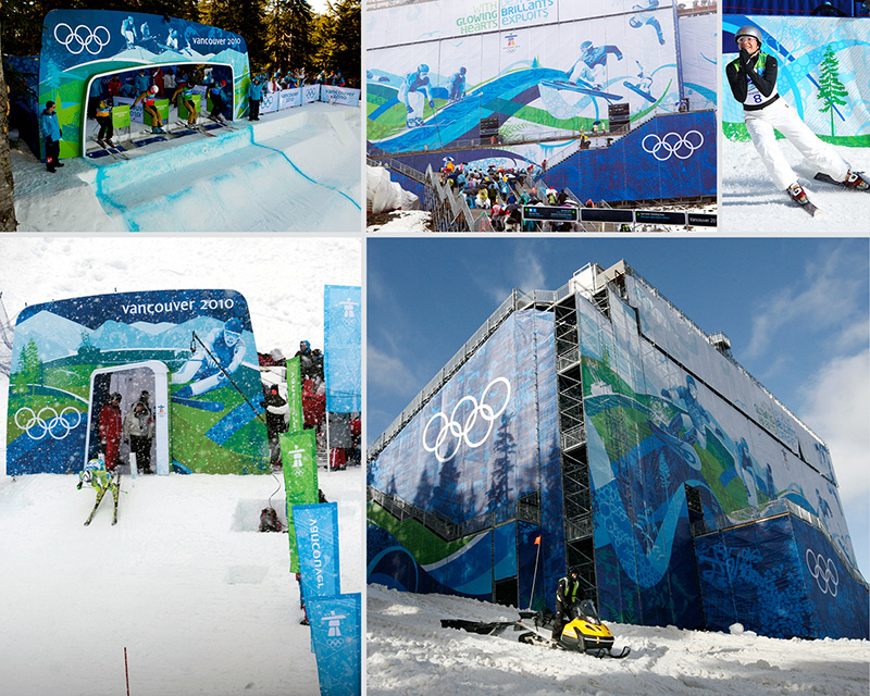
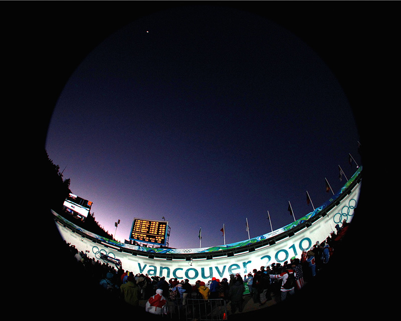
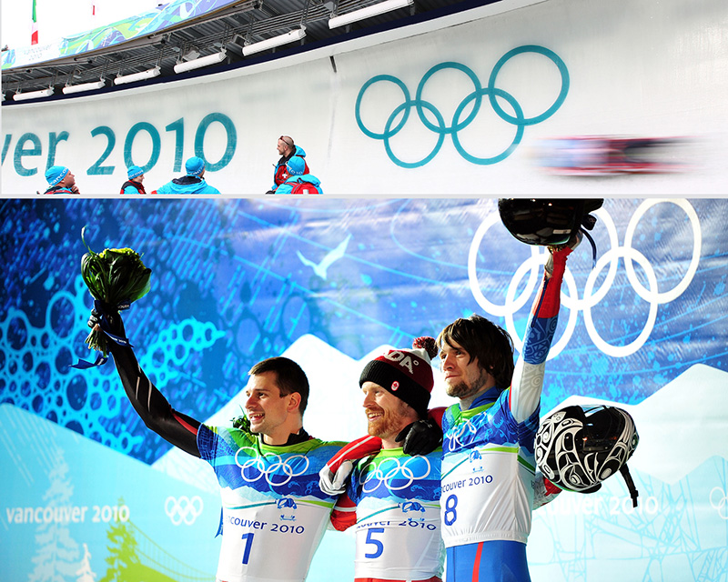
BRIEF #2 Look Manager, Look of the Games: Apply the Look of the Games to all of the mountain and city competition venues, the non-competition venues such as the Olympic Village, the airport, and the urban domain, including an extensive street banner program. Create a strategy that allows the graphic to really tell the story of who we are as a Games, as a region, and as a nation. Create an environment that inspires athletes to do their best, that brings out the Olympic spirit in all of us, and maximizes opportunities for our brand to appear in both photography and on broadcast.
ROLES: A true collaboration — each of the 7 designers* took their concepts and brought them together creating what proudly became our “Look of the Games” under the direction and support of 3 leaders.** And then it was up to the Look design team*** to apply the graphic system to the Games time environment.
*Jason Esteban, Karen Clark, Shawn Parkinson, Melanie Kimmet, Ben Hulse, Chloe Douglas, and me
** Leo Obstbaum, Ali Gardiner, and Steve Lange
*** Jason Esteban, Karen Clark, Jenny McCleery and me